Saturday, October 28, 2023

 Hello World Wide Web,

It has been a long while since I've added to this blog space. There are many reasons, but chief among them was a new job (I now teach technology/engineering to middle school students), weekend work for my local union was consuming blog time, and just being generally tired! I'm beginning to work with teachers again and figured it's a good time to be getting back into the blogging game. I don't expect to have kept much of my previous audience, but to be honest, I'm glad to just start journaling again. While I haven't blogging for the last few years, I have been busy. I'll write about it and perhaps the others will still find some value to these ideas. Let me know your thoughts if you stumble upon this space and find something worthwhile here.

Best,

John

Thursday, May 9, 2019

Student Placement with a Google Sheet and STAR


I’ve been steadily making improvements to my Student Placement system and thought others might find it useful. It is a juiced up Google Sheet that integrates with the STAR RTI screener. We have been using it for years and the time spent on student placement has been cut in half. You will find two sheets linked below - a blank template and a demo file with some fake data added to provide context.

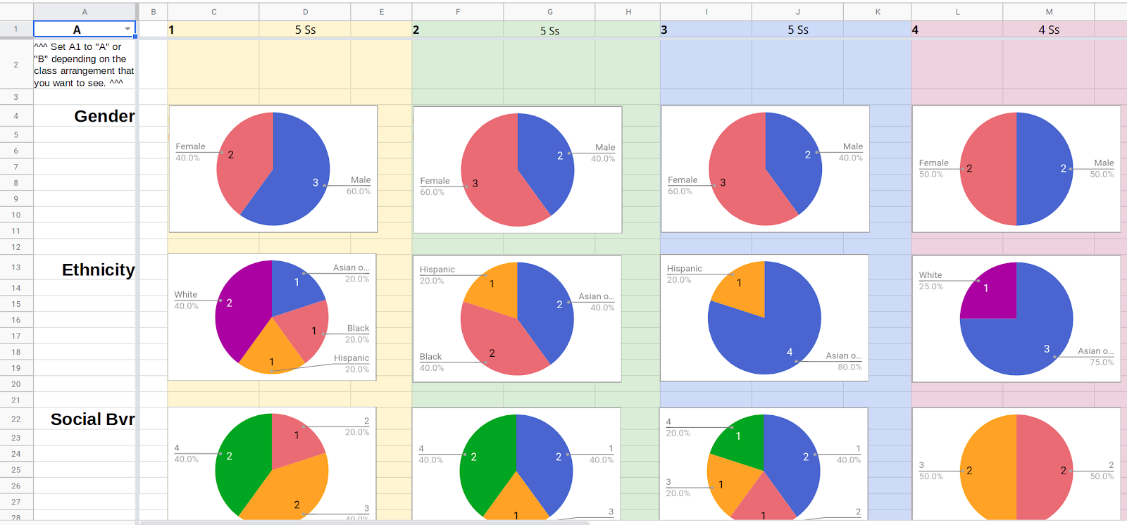
The system calculates student data automatically, both from data recorded with the STAR RTI screener and from teacher reporting. Data can be exported from STAR and easily added to the sheet. Then teachers add their own feedback - filling in services, behavior, attention to task, reading, math, and writing observations. The placement team organizes students into different classes for the upcoming year. Classes can be analyzed using different data points which can be changed dynamically using the controls all the way on the right of the class roster sheet sheet.

The system has several dashboards and can record two sets of placement, just in case a grade level is close to splitting or contracting. The dashboards include a class roster view, a chart view, an in focus page, and a numbers dashboard. We most often use the class roster and chart views during placement. The in-focus page can feed photos automatically, too, if you have a photo DVD from your photographer that uses student ID to name files.

I created an instructions page for administrators and teachers to help make this easier to set up and use. You can take a look at the posts written for the previous versions, too. They work in a similar way and some of the posts went into greater detail. Let me know if you try it. You can ask me questions or provide feedback here or on Twitter. Thanks!


Friday, April 19, 2019

Administrative Internship Experiences Log Using Google Sheets and Forms


I built this system for students in the Educational Leadership program at Long Island University. Students are required to complete an administrative internship where 450 hours must be applied to 50 administrative competencies. This process demands a fair amount of logging hours and record keeping. Fortunately, it’s the perfect use case for Google Sheets and Forms. You may have found yourself to this post because you are an LIU student, or you may be looking for help creating your own logging system, either way, welcome. Be sure to leave a comment if you have any questions.


The system documented here allows students to use a Google form, from a computer or a mobile phone, to log competencies completed, time, and record detail. Once submitted, the sheet groups experiences automatically by competency, the dates are recorded and the hours tabulated. Experiences aligned the LIU “Internship Rubric” are automatically added under the appropriate strand. The number of competencies and the hours earned  are tallied. The log and rubric can be printed and added to the portfolio once the target 450 hours and 50 competencies are complete.


How do I set it up?
  1. Rename the file by clicking on the name "Copy of LIU Hudson School of Education: Administrative Field Experiences Form 2" on the top left.
  2. Open your Form.
    Look at the Google Spreadsheets menu. Click the item "Form" and then select "Go to live form."
  3. Copy the web address of your Form.
  4. In the form that opens, select and copy the entire web address from the browser address bar.
  5. Navigate to the Log page.
    On the bottom of the spreadsheet are 4 pages, Directions, Log, Rubric, and Form Responses 1. Click on "Log."
  6. Paste the form web address into cell A3. It is the orange cell near the top left of the sheet.
  7. Type the name information at the top of the "Rubric" page. Click the "Rubric" page on the bottom of the sheet and fill out the appropriate information at the top. You do not need to edit the hours completed. This is automatic.


How do I use this?
Using the Field Experiences form is easy! You must add every experience you have using the form alone. This adds all of the information that you need in the way that the system understands. You can open the form directly from link that appears in cell A4 once you complete Step 6 above. You can bookmark the form link on your browser or open it directly on your phone. As you submit experiences via the form, the hours total updates automatically in cell C1 and the competencies total updates in E1 at the top of the "Logs" page.


Can I edit an experience after I submit the form?
Yes. But ONLY on the "Form Responses 1" page below. If you manually edit the form responses, please remember that the Competencies listed in column C must use the same words and punctuation as those listed on the "Log" page. I recommend that you copy and paste.


Can I change anything on the "Log" page?
Nope. This page updates automatically when you submit a form. It is designed to be printed so that you and your mentor can sign a paper copy. Use the Form Responses page if you want to edit a date or an event.


How about the Rubric page? Can I edit that?
Yes. The only thing that can't be edited are the experiences (in the grey boxes) that are listed under each strand. These come directly from the "Log" page. Everything else is designed to be directly edited or completed after the rubric is printed.


Sunday, October 14, 2018

Google Sheets Powered PO Generator


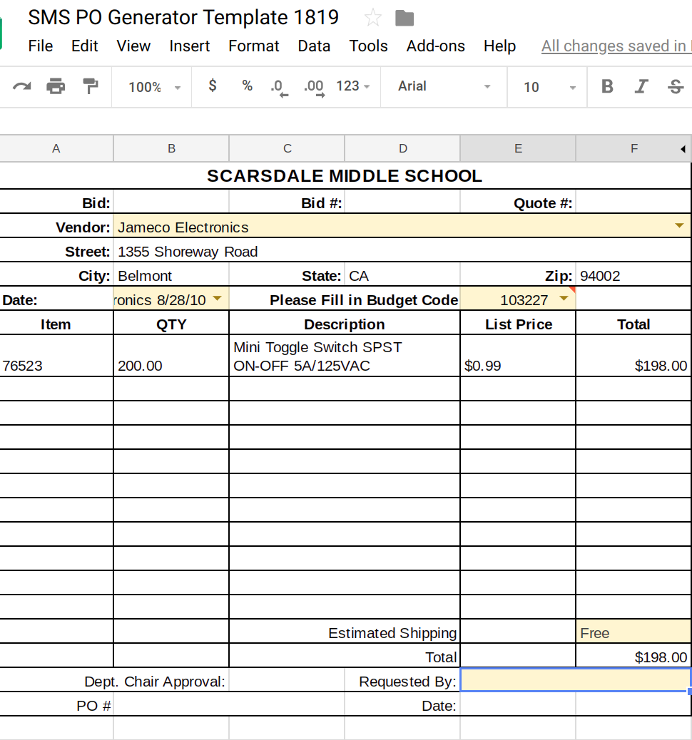
Writing purchase orders is one of the least favorite parts of my job. It’s often a repetitive and monotonous task that requires a deep dive into a file cabinet, a massive catalog, or both. I created this spreadsheet tool to make POs a little less onerous. This system keeps track of your orders, allows you to take notes, monitors your budget in different budget codes, and will actually generate the printed PO sheet! Make a copy if you would like to use the sheet. I hope you find this as useful as I do.

Setting up the sheet is easy. Just add your vendor information to the Vendor Tab. As a general rule, anything in the sheet with a yellow background can be edited. Anything with a grey or black should not be edited. These are controlled with functions. Adding vendor addresses is a one-time outlay of work. The address will auto-fill on the POs. I include my own information here, too, because there are certainly times when I purchase something from a vendor not on the bid list (Amazon, anyone?) and need to submit a PO with me as the vendor. You can add vendors as you need them, secure in the knowledge that the address will be ready the next time a PO is generated for that seller.

Also on the Vendor sheet is a budget code table. I have two budget codes as a technology teacher, one for supplies and another for equipment. In order to keep track of your codes, add the total amount you have to spend and the codes themselves in the appropriate columns (yellow only.) You’ll notice that the sheet automatically keeps track of the amount left in each budget code and the supplies code has a function that helps me keep track of per student expenditure.

The “Master Sheet” is where I fill out my orders (yellow cells only.) It's fairly self explanatory. One this thing I need to point out: the first two columns seem redundant but are not! The first column allows me to specify an order on a specific day, the second column is only the vendor name, linked to your vendor sheet. This second column controls the address information and is independent of the date. Both are necessary!

Once your order is recorded on the “Master Sheet” you can generate your PO. Now you have one place for all your PO records and you don’t have to worry about handwriting a PO form. Better yet, next year I have a clear record and can reorder easily. Open the PO Generator tab. You will notice four yellow cells, three with drop down boxes. Select your Vendor, which will populate all of the address fields. Then, select the date the PO was written, which is fed from the first column of the “Master Sheet.” Finally, select the budget code, write in the potential shipping cost, and add your name in the “Requested by:” field.

Your PO Is ready to print! This has made PO writing so much easier for me. I keep notes on my Master Sheet, such as when an order arrives, or if I was unhappy with the product. My record keeping is better and the process is a lot faster. This was designed using the Scarsdale PO form, so you may need to redesign the PO Generator layout. Let me know if you use this and if you’ve made it better!


Saturday, September 15, 2018

Infographic University


Our students publish their first infographics in second grade, and then cycle back in fifth with an Infographic designed for a state research project. These graphics expect more. Students are taught more about graphic design and how to visualize data in an engaging way. The trick is teaching students how to use the design tool, in this case Google Drawings, at the same time. Inspired by the design tutorials provided by Canva, Infographic University was born.

It must be noted that this is a culminating activity to a research unit. Students study one of the states and use this graphic organizer to record and organize their research. Students decide on the best information to share on their graphics. This is a critical step to the success of the project. Garbage in, garbage out, right?

Infographic University is a self-paced introduction to infographic design, but it starts with explicit instruction. On day one students are shown examples of infographics and then complete this graphic organizer in small groups to identify the use of color, fonts, visuals, and organization. These noticings are discussed as a class.


On day two, the university files are introduced. Infographic University has four self-paced files, numbered in the order that students will complete them. A copy of the files must be made for each student so that they can edit them. I would introduce how the files work, modeling how you use the zoom tool in Drawings to get very close and read the directions. Then, show how you can move around the file using two finger swipes or by zooming out and zooming back in. These are good strategies to be familiar with when they start designing their own graphic.

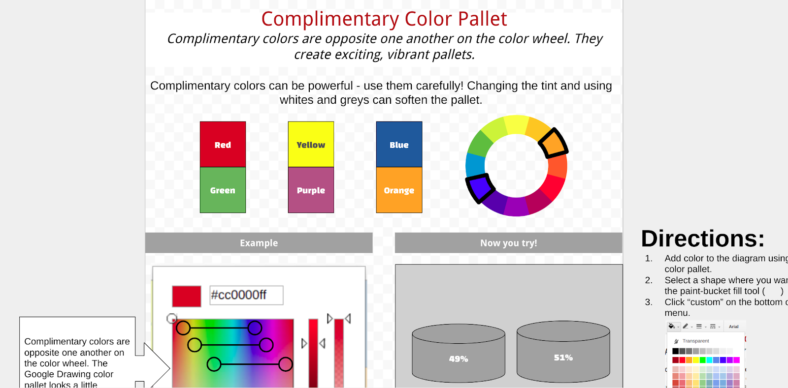
Each University file is broken down into lessons. Lessons introduce an idea, such as using negative space, then ask students to practice the idea. Each lesson includes step by step directions in the margins of the Drawing file - but the design choices are up to the student. The teacher can review the files to see if the concept was understood successfully. Students have created infographics on making infographics when they’ve finished Infographic University.

The infographic template is copied for the student when the four university files are completed. I’ve found that students need another lesson of direct instruction on how to use the template, but then they are off to the races. Using the resources in the margins, a color pallet is selected (one of the skills practiced in the University) and students select the layouts for each section. Some graphics that are helpful for representing data are also available in the margin.


When the graphic is complete, students link their research graphic organizer as the source file at the bottom. The margin also includes a checklist, requiring students to reflect on the design principles practiced in the University files.  I think this approach worked really well. Students were give a good blend of autonomy and structure in order to be successful and still think critically. Let me know if you use any of these files, I’d love to hear about your experience. More importantly, let me know if you’ve improved them!

Sunday, November 12, 2017

Well Played, Vermont

“Messy, Hectic, and Exciting…”

I couldn’t imagine a better way to describe the essential experience of learning. It was more than enough to catch my eye as I scanned EdWeek this weekend. In a piece titled “Messy, Hectic, and Exciting: A Very Ambitious Statewide Personalized Learning Experiment,” author Kevin Bushweller describes how schools are implementing and interpreting Vermont’s new law, Act 77, also known as Flexible Pathways. The article optimistically provides an alternative narrative to the test driven culture that has infected K-12 education.
Act 77 requires all students to create a “Personal Learning Plan” (PLP) that communicates student strengths, weaknesses, and goals, while providing children with an opportunity to reflect on their learning and their future. It’s a heady charge but it sounds like the type of worthwhile examination that should be engaged by every secondary student. I'm trying to wrap my head around this plan and have many questions: What standards are being used? What does a PLP look like? How much change happens from year to year? How much time goes into a student’s pursuit of their Personal Learning Plan?
Vermont’s Agency of Education has created a checklist to outline the minimum requirements for a PLP. The list is extensive and includes a good dose of introspection. Questions like “What do you stand for?” and the inclusion of a learning styles inventory demonstrates a meta-analysis that I have not seen since the Ted Sizer Essential School’s Movement. Also noted were concrete action steps that require goals, timelines, and the verification of achievement. This template provides a basic format for a PLP, although it seems that each school is approaching PLPs in a different way.
Bushweller describes a student from Champlain Valley Union High School who conducted a 30 minute presentation of her PLP to a panel of teachers and other adults. Initially dismissive, the teen found the process, and the feedback she received, empowering and valuable. This seems to be a more purposeful format than filling out an online form. However worthwhile, I can’t help but wonder about the scheduling realities of accommodating this level of 7-12 presentation!
This is an exciting initiative to watch grow.  In many ways, Flexible Pathways reminds me of the 5th grade capstone project that we do in Scarsdale. Unlike our capstone, the student PLPs will grow and evolve from year to year. The focus on learner strengths, growth, and goals is powerful and connecting these elements to personal passions is a distinguishing feature of the program. I am impressed and plan on delving into the Flexible Pathways Google Site, which hosts a myriad of resources and webinars, to learn more.
My hat is off to you, Vermont. I can't wait to see where you go with this and hope New York and follow your lead!


Saturday, October 15, 2016

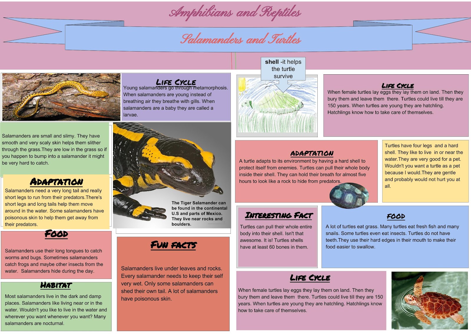
2nd Grade Infographics with Google Drawings


Infographic  Salamanders and Turtles.jpg


This is a overdue follow-up on my “Infographics Two Ways” post. Late last year I decided to eschew Canva in lieu of Google Drawings based on the success my students found in their Immigration Poster project. My first test was with the second grade and they did a bang up job creating non-fiction infographic posters in Drawings.


I worked closely with my school Librarian, Kate Byrnes, to help acquaint our second grade students to the infographic genre. She immersed them in National Geographic Kids magazines and books, primarily using animal focused examples. Kate also found the Discovery Kids “Find Out” site. This is a gem, and one that I hope stays free. I like how it takes advantage of the digital medium by incorporating video, sound, and other interactive features into the infographics. This could be an interesting way to push future projects.


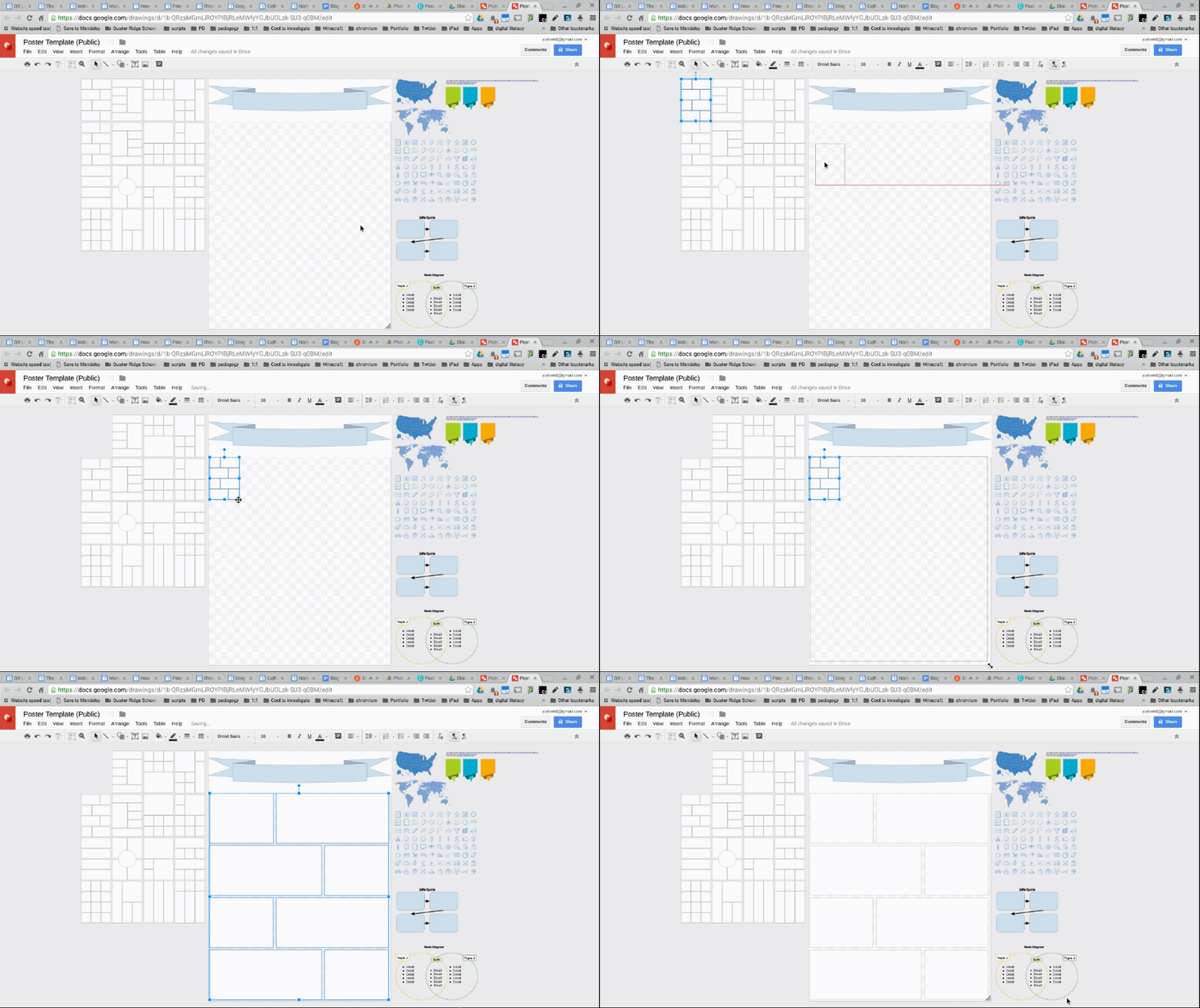
Like the 5th grade Interview project, students started with a drawing template. They chose a format from the side bar and scaled it to fit their canvas. After selecting a format, I recommend that students delete the other formats. I found that the alignment guides get annoying if you keep the extra shapes on the side. All the “false positives” can get in the way of the important function of the guides.


Poster.gif


Different classes approached the project in different ways. Mrs. Iasiello wanted to compare amphibians and reptiles so we created a wide format poster. This allowed students to pick two formats, for the left and right of the poster. Mrs. Chueng’s class featured mammals, so the students picked a single format using the vertical format. An element that I loved on Mrs. Chueng’s infographics were the hand drawn pictures of the mammals. Students used callouts in Google Drawing to label them. It was authentic and beautiful.

This project is a keeper and I can’t wait to see how it evolves this year. It provides a context to discuss audience, clarity, and creating a design that augments your information. Students had to be careful about image placement, scale, font choice, and color. Each student was successful and created something they made them proud. Maybe this year we can build in some of those interactive features found in DK Find Out. Let me know if you have any questions or if you use these templates!