Our students publish their first infographics in second grade, and then cycle back in fifth with an Infographic designed for a state research project. These graphics expect more. Students are taught more about graphic design and how to visualize data in an engaging way. The trick is teaching students how to use the design tool, in this case Google Drawings, at the same time. Inspired by the design tutorials provided by Canva, Infographic University was born.
It must be noted that this is a culminating activity to a research unit. Students study one of the states and use this graphic organizer to record and organize their research. Students decide on the best information to share on their graphics. This is a critical step to the success of the project. Garbage in, garbage out, right?
Infographic University is a self-paced introduction to infographic design, but it starts with explicit instruction. On day one students are shown examples of infographics and then complete this graphic organizer in small groups to identify the use of color, fonts, visuals, and organization. These noticings are discussed as a class.

On day two, the university files are introduced. Infographic University has four self-paced files, numbered in the order that students will complete them. A copy of the files must be made for each student so that they can edit them. I would introduce how the files work, modeling how you use the zoom tool in Drawings to get very close and read the directions. Then, show how you can move around the file using two finger swipes or by zooming out and zooming back in. These are good strategies to be familiar with when they start designing their own graphic.
Each University file is broken down into lessons. Lessons introduce an idea, such as using negative space, then ask students to practice the idea. Each lesson includes step by step directions in the margins of the Drawing file - but the design choices are up to the student. The teacher can review the files to see if the concept was understood successfully. Students have created infographics on making infographics when they’ve finished Infographic University.
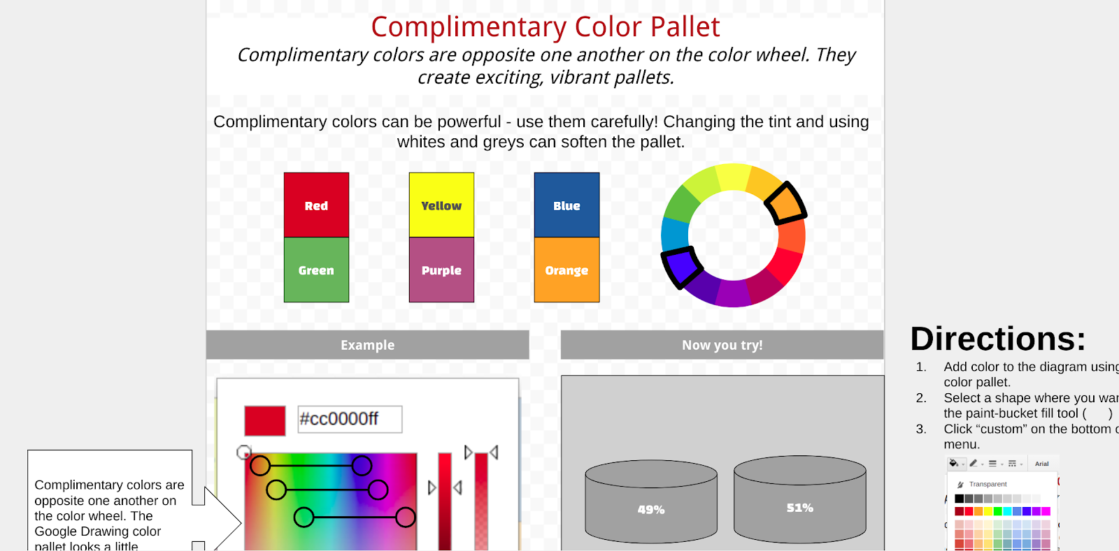
The infographic template is copied for the student when the four university files are completed. I’ve found that students need another lesson of direct instruction on how to use the template, but then they are off to the races. Using the resources in the margins, a color pallet is selected (one of the skills practiced in the University) and students select the layouts for each section. Some graphics that are helpful for representing data are also available in the margin.

When the graphic is complete, students link their research graphic organizer as the source file at the bottom. The margin also includes a checklist, requiring students to reflect on the design principles practiced in the University files. I think this approach worked really well. Students were give a good blend of autonomy and structure in order to be successful and still think critically. Let me know if you use any of these files, I’d love to hear about your experience. More importantly, let me know if you’ve improved them!
No comments:
Post a Comment