Saturday, September 15, 2018

Infographic University


Our students publish their first infographics in second grade, and then cycle back in fifth with an Infographic designed for a state research project. These graphics expect more. Students are taught more about graphic design and how to visualize data in an engaging way. The trick is teaching students how to use the design tool, in this case Google Drawings, at the same time. Inspired by the design tutorials provided by Canva, Infographic University was born.

It must be noted that this is a culminating activity to a research unit. Students study one of the states and use this graphic organizer to record and organize their research. Students decide on the best information to share on their graphics. This is a critical step to the success of the project. Garbage in, garbage out, right?

Infographic University is a self-paced introduction to infographic design, but it starts with explicit instruction. On day one students are shown examples of infographics and then complete this graphic organizer in small groups to identify the use of color, fonts, visuals, and organization. These noticings are discussed as a class.


On day two, the university files are introduced. Infographic University has four self-paced files, numbered in the order that students will complete them. A copy of the files must be made for each student so that they can edit them. I would introduce how the files work, modeling how you use the zoom tool in Drawings to get very close and read the directions. Then, show how you can move around the file using two finger swipes or by zooming out and zooming back in. These are good strategies to be familiar with when they start designing their own graphic.

Each University file is broken down into lessons. Lessons introduce an idea, such as using negative space, then ask students to practice the idea. Each lesson includes step by step directions in the margins of the Drawing file - but the design choices are up to the student. The teacher can review the files to see if the concept was understood successfully. Students have created infographics on making infographics when they’ve finished Infographic University.

The infographic template is copied for the student when the four university files are completed. I’ve found that students need another lesson of direct instruction on how to use the template, but then they are off to the races. Using the resources in the margins, a color pallet is selected (one of the skills practiced in the University) and students select the layouts for each section. Some graphics that are helpful for representing data are also available in the margin.


When the graphic is complete, students link their research graphic organizer as the source file at the bottom. The margin also includes a checklist, requiring students to reflect on the design principles practiced in the University files.  I think this approach worked really well. Students were give a good blend of autonomy and structure in order to be successful and still think critically. Let me know if you use any of these files, I’d love to hear about your experience. More importantly, let me know if you’ve improved them!
Sunday, November 12, 2017

Well Played, Vermont

“Messy, Hectic, and Exciting…”

I couldn’t imagine a better way to describe the essential experience of learning. It was more than enough to catch my eye as I scanned EdWeek this weekend. In a piece titled “Messy, Hectic, and Exciting: A Very Ambitious Statewide Personalized Learning Experiment,” author Kevin Bushweller describes how schools are implementing and interpreting Vermont’s new law, Act 77, also known as Flexible Pathways. The article optimistically provides an alternative narrative to the test driven culture that has infected K-12 education.
Act 77 requires all students to create a “Personal Learning Plan” (PLP) that communicates student strengths, weaknesses, and goals, while providing children with an opportunity to reflect on their learning and their future. It’s a heady charge but it sounds like the type of worthwhile examination that should be engaged by every secondary student. I'm trying to wrap my head around this plan and have many questions: What standards are being used? What does a PLP look like? How much change happens from year to year? How much time goes into a student’s pursuit of their Personal Learning Plan?
Vermont’s Agency of Education has created a checklist to outline the minimum requirements for a PLP. The list is extensive and includes a good dose of introspection. Questions like “What do you stand for?” and the inclusion of a learning styles inventory demonstrates a meta-analysis that I have not seen since the Ted Sizer Essential School’s Movement. Also noted were concrete action steps that require goals, timelines, and the verification of achievement. This template provides a basic format for a PLP, although it seems that each school is approaching PLPs in a different way.
Bushweller describes a student from Champlain Valley Union High School who conducted a 30 minute presentation of her PLP to a panel of teachers and other adults. Initially dismissive, the teen found the process, and the feedback she received, empowering and valuable. This seems to be a more purposeful format than filling out an online form. However worthwhile, I can’t help but wonder about the scheduling realities of accommodating this level of 7-12 presentation!
This is an exciting initiative to watch grow.  In many ways, Flexible Pathways reminds me of the 5th grade capstone project that we do in Scarsdale. Unlike our capstone, the student PLPs will grow and evolve from year to year. The focus on learner strengths, growth, and goals is powerful and connecting these elements to personal passions is a distinguishing feature of the program. I am impressed and plan on delving into the Flexible Pathways Google Site, which hosts a myriad of resources and webinars, to learn more.
My hat is off to you, Vermont. I can't wait to see where you go with this and hope New York and follow your lead!


Saturday, October 15, 2016

2nd Grade Infographics with Google Drawings


Infographic  Salamanders and Turtles.jpg


This is a overdue follow-up on my “Infographics Two Ways” post. Late last year I decided to eschew Canva in lieu of Google Drawings based on the success my students found in their Immigration Poster project. My first test was with the second grade and they did a bang up job creating non-fiction infographic posters in Drawings.


I worked closely with my school Librarian, Kate Byrnes, to help acquaint our second grade students to the infographic genre. She immersed them in National Geographic Kids magazines and books, primarily using animal focused examples. Kate also found the Discovery Kids “Find Out” site. This is a gem, and one that I hope stays free. I like how it takes advantage of the digital medium by incorporating video, sound, and other interactive features into the infographics. This could be an interesting way to push future projects.


Like the 5th grade Interview project, students started with a drawing template. They chose a format from the side bar and scaled it to fit their canvas. After selecting a format, I recommend that students delete the other formats. I found that the alignment guides get annoying if you keep the extra shapes on the side. All the “false positives” can get in the way of the important function of the guides.


Poster.gif


Different classes approached the project in different ways. Mrs. Iasiello wanted to compare amphibians and reptiles so we created a wide format poster. This allowed students to pick two formats, for the left and right of the poster. Mrs. Chueng’s class featured mammals, so the students picked a single format using the vertical format. An element that I loved on Mrs. Chueng’s infographics were the hand drawn pictures of the mammals. Students used callouts in Google Drawing to label them. It was authentic and beautiful.

This project is a keeper and I can’t wait to see how it evolves this year. It provides a context to discuss audience, clarity, and creating a design that augments your information. Students had to be careful about image placement, scale, font choice, and color. Each student was successful and created something they made them proud. Maybe this year we can build in some of those interactive features found in DK Find Out. Let me know if you have any questions or if you use these templates!

Saturday, April 30, 2016

Student Placement with a Google Sheet

It’s that time of year when teachers thoughtfully build classes for next September. A while back I built a Google Sheet to help visualize the process with charts and graphs in real time. Each year I try to improve it based on the experiences from the previous year. I’ve tried to make the system easy for other schools to use, too, making most of the variables editable from a sheet. This post will introduce the 2016 articulator. Please note that all of the data used in this example is fake and was created using mockeroo.


How it Works
This system uses teacher feedback and optional data from the STAR RTI screener to create a series of visual dashboards. Each dashboard (numbers, roster, charts, and focus) works in real time to balance student placement when creating next year’s classes. There is some setup required, but I’ve worked hard to make it easier. You can follow the written directions for administrators here.


Teacher Input
Once a grade level is prepared, teachers add scores for student behavior and academics. Then teachers fill in any special services that are being delivered and add any other pertinent notes. As per last year’s feedback, behavior has been split into a social and an “attention to task” component. Manual categories for ELA and Math have also made a return, being left out in lieu of STAR data last year. Teachers felt that the STAR scores were not adequate alone. Fortunately, this makes the system more adaptable to schools who don’t use STAR. I’ve included directions for classroom teachers here.


Student Placement
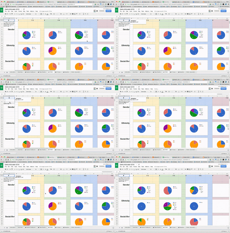
My teachers often complete an initial placement before our first official meeting by changing the class number in the first column of the Data Beta sheet. Column B can be used If it is believed that a class might split or contract. The number of classes available in each set can be adjusted from the variable sheet. Each of the Dashboard sheets can switch from class set A or B by using a drop down menu in the top left. This configurability allows you to see how the proposed classes look in each configuration. You adjust the classes using the A and B columns on the Data Beta sheet during your placement meeting and the dashboards update in real time. Because the sheet is shared with everyone involved in placement, many eyes can watch for issues. Typically we appoint one person to be the official "updater" to keep confusion down.


Student Photos
This year I added student photos to the “In Focus” sheet. This optional feature requires the photos to be named using your student ID numbers and uploaded to a web directory (For the example I use the attachments feature of a Google Site.) Then paste the URL of the web directory into cell J15 of the Variables sheet. Since different systems export student photos using different formats, make sure you select the appropriate file type in cell J14.

Hope it Works for You, too!
This system has been extremely helpful during our student placement meetings. I hope it can be useful to others, as well. I’ve tried to make the system customizable and extensible and I’ll happily answer any setup questions in the comments. Please contact me directly on Plus or Twitter if you need help making any significant modifications.

Thursday, April 28, 2016

Infographics in Two Ways


This year I wanted to use infographics with my 5th grade students to explore visual design. This format provides a rich vehicle to teach color, typography, and even statistics. Earlier in the year my 5th grade students explored Canva.com and they recently used a Google Drawing template. This post will look at the product from each and compare the two experiences.


Canva


Canva came very well recommended by my PLN and I jumped in with two feet. I created a free account for my teachers to be in compliance with COPPA and had students share a log in. The tool managed multiple sign-ins well, although it would occasionally freeze under the strain. When this happened, students learned to save their graphic and refresh the browser. It wasn’t a big deal and I have no doubt that our experience would have been smooth if we were able to create individual accounts using our student Google sign-ins.
I LOVED the Canva design school. Canva provides resources and slide decks for teaching, but I particularly appreciated the Canva lessons found behind the sign in wall. The lessons use Canva’s interface to teach the basics of graphic design in discrete tutorials, including one on making infographics. Students proceed through these lessons at their own pace and I stop them periodically to discuss what they’ve learned.
My students used Canva to create infographics to share what they learned after studying a U.S. State. Although they found the Canva interface intuitive, we discovered that it doesn’t easily support long form content, preferring designs with quick facts. Students needed to set very small type sizes in order to accommodate paragraph-style writing and much of their research was left in their notes.  In fairness, I’ve found Canva works quite well for succinct posters and web graphics, but you might want to try a different tool if you want your class project to feature deeper content.


Google Drawing

IMG_20160428_094609886.jpg


We decided to use Google Drawing to create posters for a fifth grade heritage project. Students had interviewed teachers about their family histories and they needed a way to design posters to showcase what they’d learned.  I turned to Google Drawing after realizing that Canva wasn’t well suited for long form content. In the past we used Apple’s Pages for this project, but found the number of templates in the new Pages thin and the collaborative capabilities were limiting. Collaboration was important as our students were working groups.
A lack of templates is a mixed blessing. In the past, the Pages templates would be too guiding, robbing students of important design decisions. On the other hand, we didn’t really have time to start completely from scratch and created a nice middle ground by starting with a Google Drawing template.
The template was inspired by the “Grid” designs in Canva. Students pick a grid from the left margin and scale it to fit the poster.  Once scaled, the grid can be ungrouped, colorized, reorganized, or completely redesigned. The image crop, text boxes, or simply double clicking the cells provided by the grids create a flexible and easy to use solution. On the right of the page are items from Google’s Infographic Toolkit and icons from a SlidesCarnival presentation. Students can use these elements as necessary. Best of all, both members of each team are able to edit at the same time using their Chromebooks. The built in commenting feature was welcome and comfortable from a teacher’s perspective. Compared with Canva, it should be no surprise that I found it much easier to provide feedback to students with Google Drawing.


Conclusion


Both Canva and Google Drawings are capable tools for Infographics. I think the Google Drawing project was more successful, but I honestly wonder if that’s not in part because of the Canva experience they had earlier in the year. The Canva Design School is really well done and students benefited from what they learned during the project. I still have students who are choosing Canva for various projects which is a testament to the tool. That said, Google Drawing is an amazing and flexible powerhouse. The grid system, co-opted from Canva, was a big advance in how this project developed. I will still use Canva earlier in the year, but students will link from the various infographic sections to a Google Doc for more information. The Canva component will work like a magazine insert, rather than a stand alone product. We’ll also stick with the Google Drawing poster - it’s a winner.

Monday, March 28, 2016

Social Bookmarks using a Google Form & Awesome Tables


Last January I had the pleasure of attending a Teacher’s College workshop hosted by Dr. Heidi Hayes Jacobs.  Dr. Jacobs reminded us that the process of evaluation, selection, and categorization is especially valuable in our information rich world. She encouraged us to help our students curate their own web experiences. Inspiration struck: I thought, “Why not create a social bookmarking tool for elementary students using a Google form?” I wanted to create a student-centered alternative to the static list of links that are often found on teacher sites. This post is the result of that inspiration.


Inspiration is not an individual endeavor.  If Heidi Hayes Jacobs helped me to think of the what, then +Baptiste Quin showed me the “how.” Baptiste generously shared an Awesome Table experiment, gorgeously modeled after Google Keep. He opened my eyes to the potential of using CSS with Awesome Tables and provided the perfect starting place for my project. So, a big thanks goes out to Baptiste.


My remix of Baptiste’s work edits out some of his features (which are very cool in their own right, but didn’t quite fit my project) and adds others. Each bookmark “card” has a title, a description, information tags, how many times the bookmark was shared, who submitted the site and when. Students share bookmarks using a Google Form. I tried to design the form to be as short as possible to make adding a bookmark easy.  The Google Sheet compares usernames (collected automatically from the form) against a list to determine the submitter's building and classroom. To further simplify the process, I’ve created a simple Chrome extension that will open the form and pre-fill the title and url of the current page. I’ll blog about this extension in another post.


I’m really excited about this system. The chrome extension makes it easy to add new sites on the fly and the Awesome Table can be embedded on any website. I’ve added the bookmark interface into our edublogs student template so that each student blog has ready access. This connects all of our students and becomes a vehicle to teach the new ISTE standard for Knowledge Curation. Feel free to copy the demo sheet and make it your own. I wrote a brief instruction page in the sheet for anyone who wants to give it a whirl, but I’ll be writing step by step directions in an upcoming post. Let me know in the comments if you use this idea, make it better, or find a bug - it would be much appreciated!


Monday, March 21, 2016

Build a Commenting system With These 5 Spreadsheet Tips


Google elevates the humble spreadsheet by bundling in forms, multi-user capacity, and the inherent connectivity of the Internet. This combination gives Google Spreadsheet application authoring-like chops. This post is going to explore this idea by making a moderated comment system using a few spreadsheet tricks.


You might ask, “Why?” Well, this system uses some functions that I use a lot, so it's a handy vehicle to talk about them. That said, there are reasons why we've used this at Quaker Ridge. Some sites don’t have built in commenting features, especially sites built on education content management systems. Other platforms, like Google Sites, have comments, but they can’t be moderated. Systems like Disqus are popular and powerful, but give you little control over what is done with your data. This is gross in general, but it’s particularly foul in the K-12 edu space. Finally, it can be more communal than a blog post comment. We can create a meta comment feed that insulates young children from the “I don’t get any comments but my friend gets so many” problem. So here you go, 5 tips to make your own comment system!


Tip 1: Use Validation!
Every good comment system needs a form to submit. My comment form has three questions, a teacher name drop down so that the comments can be filtered by class. An optional text box so that the person commenting can leave a name if wanted. And a paragraph text box for the comment. This last item is validated (click the advanced settings under the question) to 280 characters. I figure that twice the length of a tweet is enough to ask a question or provide feedback, but adjust accordingly.


Validation Gif.gif


Tip 2:  Use a QUERY for Moderation
I use this trick often. You’ll also find it in the Twitter Exit Ticket and the Book Review form. A query will take data from one page and display it on another, based on criteria that you declare. This criteria could be a number rage, or specific values, and can use boolean operators such as “OR” and “AND.”  I simply add a “Moderation” column to the right of my form sheet. Then, I add a query to a new sheet that watches this column for a value of ‘yes.’


=QUERY(data!A1:E, "where E = 'yes'",1)


This sheet is what gets sorted by the comment page. Since I use one system for several teachers, I include the “AND” operator to also look for a specific teacher’s name.


=QUERY(data!A1:E, "where E = 'yes' AND B = 'Teacher 1'",1)


It’s useful to learn how to write a query, but until you do, just use Bjorn Behrendt’s very cool EZ Query add-on.


Tip 3: Reverse the Order of the Comments
When someone submits a Google Form, the last response shows up under the previous submissions. Typically, you want the opposite with comments, with most recent submission first. We can use a SORT function to change the order. Add another sheet and sort the approved comment range using the timestamp column (represented by the 1) as the sort by column.


=ArrayFormula(sort('Tip 2: Moderate'!A2:D, 1,false))


Tip 4: Join Columns With Linebreaks
A comment system will often include who made the comment and the date the comment was submitted. Unfortunately, these items are in different columns. We need to join these together and do it in an attractive way. Columns can simply be joined by using the “&” symbol. However, we also want the columns separated with carriage returns - otherwise it would look crowded. The character code for a return is “CHAR(10).” We’ll use two together to create a space between the name and the comment..


=ArrayFormula(sort((" By: ")&'Tip 2: Moderate'!C2:C&CHAR(10)&CHAR(10)&'Tip 2: Moderate'!D2:D&CHAR(10)&CHAR(10),'Tip 2: Moderate'!A2:A,false))


Tip 5: Test for Blank Rows
The last function joined all of the rows, whether or not there was a comment. This left hundreds of orphaned “By:’s” from all those empty rows. Since we only want the function to apply to rows with comments, we can use an “If( ISBLANK( ‘Column’),”  test. This combination will look at a column, 'Teacher 2 Approved Comments'!C2:C in our case, and check each row for blanks. If a blank row is found, then nothing is done ("".) However, if something is found in a row, we can execute the joining formula from earlier to construct the comment.


=ArrayFormula(sort(IF(ISBLANK('Tip 2: Moderate'!C2:C), " ", " By: ")&'Tip 2: Moderate'!C2:C&CHAR(10)&CHAR(10)&'Tip 2: Moderate'!D2:D&CHAR(10)&CHAR(10),1,false))


Ready for Publishing
Untitled GIF (1).gif


Now your comment page is ready to publish! Just click “File > Publish to the Web.” Select the comment page to publish and grab the Embed code. Then, paste that into any website that needs a moderated comment system! I’ll often set up the formMule add-on so that new comments will send an email to the teacher. Don’t forget to link to the form, too, and thanks for getting this far! Let me know in the comments if you have any questions.