Saturday, April 30, 2016

Student Placement with a Google Sheet

It’s that time of year when teachers thoughtfully build classes for next September. A while back I built a Google Sheet to help visualize the process with charts and graphs in real time. Each year I try to improve it based on the experiences from the previous year. I’ve tried to make the system easy for other schools to use, too, making most of the variables editable from a sheet. This post will introduce the 2016 articulator. Please note that all of the data used in this example is fake and was created using mockeroo.


How it Works
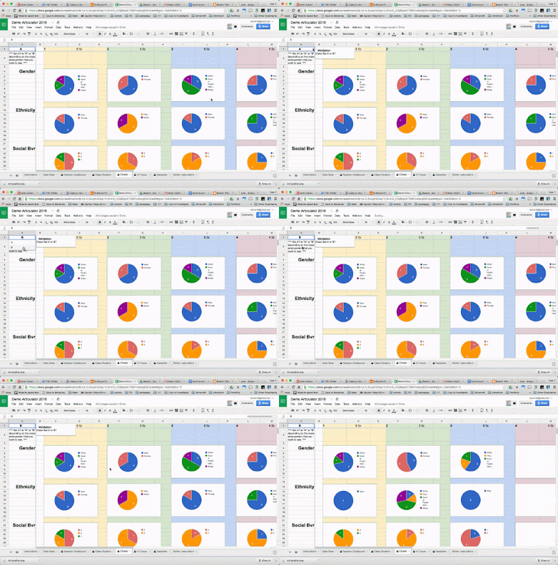
This system uses teacher feedback and optional data from the STAR RTI screener to create a series of visual dashboards. Each dashboard (numbers, roster, charts, and focus) works in real time to balance student placement when creating next year’s classes. There is some setup required, but I’ve worked hard to make it easier. You can follow the written directions for administrators here.


Teacher Input
Once a grade level is prepared, teachers add scores for student behavior and academics. Then teachers fill in any special services that are being delivered and add any other pertinent notes. As per last year’s feedback, behavior has been split into a social and an “attention to task” component. Manual categories for ELA and Math have also made a return, being left out in lieu of STAR data last year. Teachers felt that the STAR scores were not adequate alone. Fortunately, this makes the system more adaptable to schools who don’t use STAR. I’ve included directions for classroom teachers here.


Student Placement
My teachers often complete an initial placement before our first official meeting by changing the class number in the first column of the Data Beta sheet. Column B can be used If it is believed that a class might split or contract. The number of classes available in each set can be adjusted from the variable sheet. Each of the Dashboard sheets can switch from class set A or B by using a drop down menu in the top left. This configurability allows you to see how the proposed classes look in each configuration. You adjust the classes using the A and B columns on the Data Beta sheet during your placement meeting and the dashboards update in real time. Because the sheet is shared with everyone involved in placement, many eyes can watch for issues. Typically we appoint one person to be the official "updater" to keep confusion down.


Student Photos
This year I added student photos to the “In Focus” sheet. This optional feature requires the photos to be named using your student ID numbers and uploaded to a web directory (For the example I use the attachments feature of a Google Site.) Then paste the URL of the web directory into cell J15 of the Variables sheet. Since different systems export student photos using different formats, make sure you select the appropriate file type in cell J14.

Hope it Works for You, too!
This system has been extremely helpful during our student placement meetings. I hope it can be useful to others, as well. I’ve tried to make the system customizable and extensible and I’ll happily answer any setup questions in the comments. Please contact me directly on Plus or Twitter if you need help making any significant modifications.
Thursday, April 28, 2016

Infographics in Two Ways


This year I wanted to use infographics with my 5th grade students to explore visual design. This format provides a rich vehicle to teach color, typography, and even statistics. Earlier in the year my 5th grade students explored Canva.com and they recently used a Google Drawing template. This post will look at the product from each and compare the two experiences.


Canva


Canva came very well recommended by my PLN and I jumped in with two feet. I created a free account for my teachers to be in compliance with COPPA and had students share a log in. The tool managed multiple sign-ins well, although it would occasionally freeze under the strain. When this happened, students learned to save their graphic and refresh the browser. It wasn’t a big deal and I have no doubt that our experience would have been smooth if we were able to create individual accounts using our student Google sign-ins.
I LOVED the Canva design school. Canva provides resources and slide decks for teaching, but I particularly appreciated the Canva lessons found behind the sign in wall. The lessons use Canva’s interface to teach the basics of graphic design in discrete tutorials, including one on making infographics. Students proceed through these lessons at their own pace and I stop them periodically to discuss what they’ve learned.
My students used Canva to create infographics to share what they learned after studying a U.S. State. Although they found the Canva interface intuitive, we discovered that it doesn’t easily support long form content, preferring designs with quick facts. Students needed to set very small type sizes in order to accommodate paragraph-style writing and much of their research was left in their notes.  In fairness, I’ve found Canva works quite well for succinct posters and web graphics, but you might want to try a different tool if you want your class project to feature deeper content.


Google Drawing

IMG_20160428_094609886.jpg


We decided to use Google Drawing to create posters for a fifth grade heritage project. Students had interviewed teachers about their family histories and they needed a way to design posters to showcase what they’d learned.  I turned to Google Drawing after realizing that Canva wasn’t well suited for long form content. In the past we used Apple’s Pages for this project, but found the number of templates in the new Pages thin and the collaborative capabilities were limiting. Collaboration was important as our students were working groups.
A lack of templates is a mixed blessing. In the past, the Pages templates would be too guiding, robbing students of important design decisions. On the other hand, we didn’t really have time to start completely from scratch and created a nice middle ground by starting with a Google Drawing template.
The template was inspired by the “Grid” designs in Canva. Students pick a grid from the left margin and scale it to fit the poster.  Once scaled, the grid can be ungrouped, colorized, reorganized, or completely redesigned. The image crop, text boxes, or simply double clicking the cells provided by the grids create a flexible and easy to use solution. On the right of the page are items from Google’s Infographic Toolkit and icons from a SlidesCarnival presentation. Students can use these elements as necessary. Best of all, both members of each team are able to edit at the same time using their Chromebooks. The built in commenting feature was welcome and comfortable from a teacher’s perspective. Compared with Canva, it should be no surprise that I found it much easier to provide feedback to students with Google Drawing.


Conclusion


Both Canva and Google Drawings are capable tools for Infographics. I think the Google Drawing project was more successful, but I honestly wonder if that’s not in part because of the Canva experience they had earlier in the year. The Canva Design School is really well done and students benefited from what they learned during the project. I still have students who are choosing Canva for various projects which is a testament to the tool. That said, Google Drawing is an amazing and flexible powerhouse. The grid system, co-opted from Canva, was a big advance in how this project developed. I will still use Canva earlier in the year, but students will link from the various infographic sections to a Google Doc for more information. The Canva component will work like a magazine insert, rather than a stand alone product. We’ll also stick with the Google Drawing poster - it’s a winner.